Background
Introducing Your Place: an app designed to bring the joys of personalized interior design into the homes of New Yorkers. The city’s pace can be relentless, and home is your little haven in the chaos. This app demystifies the process of creating a space that’s a true extension of you. It’s not just about aesthetics; it’s about creating a sanctuary that aligns with your personal style and meets your functional needs—uplifting the quality of your life.
Whether you’re looking to maximize a cozy studio or bring new life to a spacious loft, Your Place provides curated recommendations to outfit your abode within your budget and space constraints. This app is a testament to the belief that good design should be accessible to all. Thanks to affiliate partnerships, it's free to use and offers a selection of furniture and home decor suggestions tailored to your taste and budget. This approach ensures a free experience for you while supporting the app’s growth.
Your home is more than just a place to sleep—it’s Your Place to live, dream, and thrive.
Research Insights
User Experiences with Interior Design Apps:
Users appreciate intuitive interfaces and features that streamline the design process.
Customization options, virtual reality tools, and personalized recommendations are highly valued.
Opportunities for improvement include enhanced collaboration features, better integration with home improvement retailers, and more robust budgeting tools.
User Needs and Aspirations:
Users seek interior design solutions that align with their personal style, values, and emotional needs.
Design decisions are often driven by a desire for functionality, aesthetics, comfort, or a combination of these factors.
Budget constraints, time limitations, and decision paralysis are common challenges faced during the design process.
Key Themes and Motivations:
Self-expression: Users want their homes to reflect their personalities and values.
Functionality and comfort: Practicality and a welcoming atmosphere are important factors.
Budget-consciousness: Affordability is a significant consideration for many users.
Aesthetics: Visual appeal and a visually pleasing space are highly desired.
User Needs and Preferences:
Users prioritize visualizations that accurately represent how design elements will look in their spaces.
Personalized recommendations tailored to individual style, budget, and space constraints are essential.
Decision-making support is crucial, especially for those who find the process overwhelming or indecisive.
Based on these insights, an ideal interior design app should:
Offer intuitive visualization tools, such as AR.
Provide personalized design suggestions and recommendations.
Incorporate features to assist users in making informed decisions.
Offer budget-friendly options and tools to help users stay within their budget.
Allow users to easily customize their designs to match their personal style.
User Personas
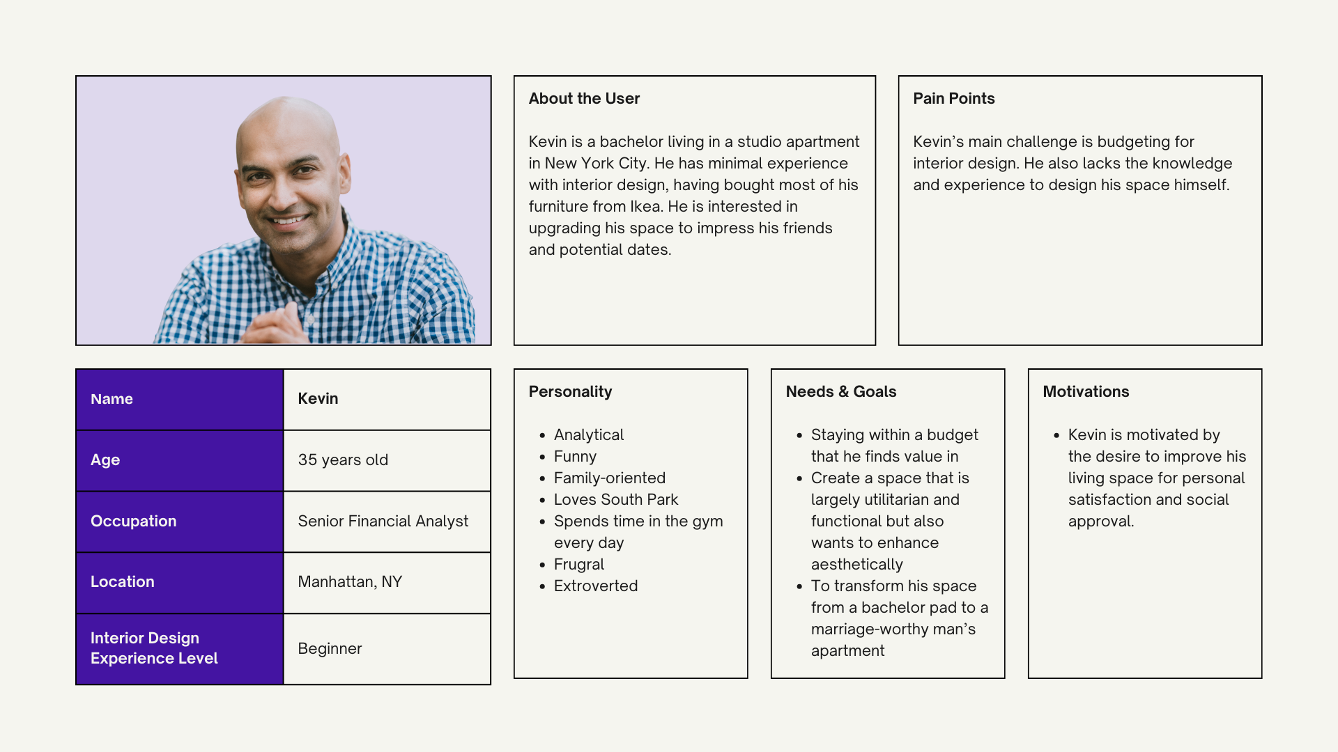
Using the research, the next step in my process was to create user personas based on actual users. To help establish a clear purpose, I was able to narrow down to the following personas:
“As a New York City renter, I’m on the lookout for ways to make my apartment feel more like a home. An intuitive solution that offers quality interior design options would be incredibly helpful. It would allow me to easily explore different styles and ideas, inspiring me to elevate my living space without the stress of complex design decisions or steep prices. ”
“How might we create an intuitive and engaging experience for New York City renters that makes quality interior design more accessible and inspires users to elevate their living spaces?”
Feature Set & Information Architecture
Based on the user research, business needs, personas, and analysis of competitors, a list of potential features for the app started to take shape.
Augmented Reality (AR) Visualizations
This feature allows users to virtually place furniture and decor in their homes, providing an easy way to visualize different design elements. This is a primary action for users and directly supports the business goal of user retention.
Comprehensive Onboarding Process
An onboarding process that gathers information about the user’s personal style, budget, and space constraints. This feature is important for the business goal of increasing user base and the user goal of personalized recommendations.
Personalized Recommendations
The app should provide design recommendations that match the user’s personal style, budget, and space constraints. This feature is important for increasing user base and user retention.
Save and Compare Design Options
Allowing users to save and compare different design options. This feature supports the user goal of decision-making support.
Affiliate Marketing
Implementing an affiliate marketing model where the app earns revenue through furniture recommendations. This is a key feature for the business goal of monetization.
Partnerships with Retailers
Establishing partnerships with furniture and home decor retailers for discounted purchases. This feature supports the business goal of monetization through affiliate marketing.
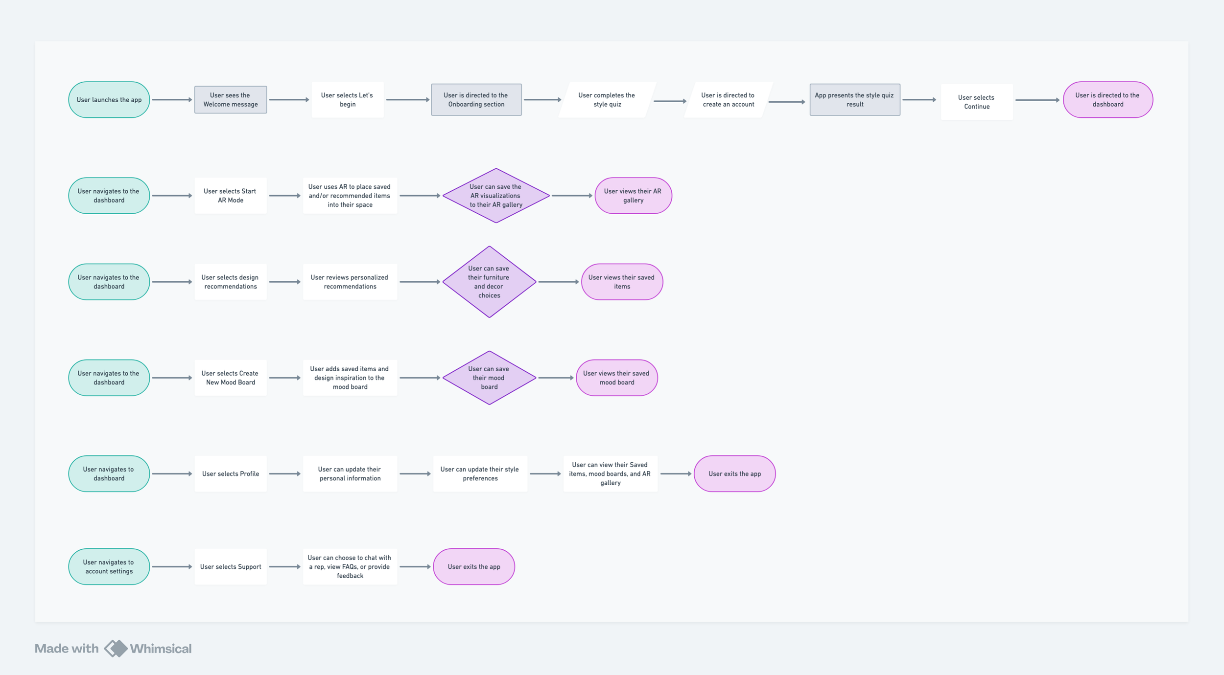
User Flows
The next step in my process is to map out user flows. This really helps me visualize and understand the user's experience, identify potential pain points, and optimize the interface for a seamless and intuitive interaction.
Mid-fidelity Wireframes
After the user flows were mapped out, it was finally time to sketch out a mid-fidelity wireframe. Using the sitemap and flows, I began bringing all the research and strategy together into an intuitive user experience.
Brand & UI Design
Defining a brand style and UI library is a meticulous process that involves establishing a set of visual elements that embody the brand’s essence across various digital platforms. I initiated this by formulating brand guidelines encompassing a color scheme, typography, and logo variations tailored to resonate with our target demographic while distinguishing our presence in the competitive interior design app market. The UI design system was then developed, featuring a suite of standardized components such as buttons, icons, cards, forms, and navigation elements.
High Fidelity Prototype
And here comes the best part. These fidelity wireframes integrate actual design elements, color schemes, and imagery to closely mirror the final application. After completing the mockups, I constructed a prototype within Figma, designing interactive frames that emulate user interactions. This involved creating connections between frames through gestures like taps or swipes to imitate a seamless user journey for testing purposes.
Usability Testing
Finally, it’s time to test my prototype with real users. This hands-on approach will help me refine the design at each stage before we commit to the full visual and functional implementation.
Positive Aspects:
Onboarding process: Users found the onboarding quiz engaging and informative.
App design: The overall design was perceived as user-friendly and visually appealing.
Functionality: Users appreciated the ability to save and review selected items, as well as the ease of using the shopping feature and filters.
Overall User Perception:
Positive: Users found the app to be useful and appreciated its features, particularly the style quiz, personalized recommendations, and AR functionality.
Negative: The AR mode was confusing for some users due to the inability to showcase their actual space.
Challenges and Suggestions:
Clarity of CTAs: Users expressed confusion about the "View in AR Mode" CTA.
Mobile UI: The hero CTA and alignment of menu options on mobile needed improvement.
Minor design improvements: Consistent iconography and other minor design tweaks were suggested.
AR limitations: Users were unable to visualize their actual space using the mobile camera in AR mode.
Based on these insights, the app should:
Refine CTA language: Use clear and concise language to describe the purpose of actions.
Improve mobile UI: Optimize the hero CTA and menu alignment for a better user experience.
Implement minor design improvements: Address suggested changes to enhance visual consistency.
Explore alternative AR solutions: Investigate ways to allow users to visualize their actual space using the mobile camera.
The Final Product
Based on the insights from usability testing, I made several important tweaks to the high-fidelity design. While users found the AR mode useful, some confusion persisted due to limitations in showcasing their actual space via mobile camera. I acknowledged this challenge and considered ways to mitigate it. I addressed the clarity issues with the Call-to-Action language. By refining phrases like “View in AR Mode” to “View in Your Place,” I mitigated the risk of a user not fully understanding what AR mode could be by adding more clarity in the UX copy. I also made some minor design improvements, including updating the Style Preferences icon in the Settings menu to avoid confusion with the Sort/Filter icon. This attention to detail contributes to a more cohesive interface.
Takeaways
While the MVP of Your Place has demonstrated potential, there are areas where additional time and resources could have further elevated the product. Here's a glimpse into how I’d envision the app's evolution:
Expanded Functionality: Integrating features like real-time collaboration, 3D modeling, and virtual staging would offer a more comprehensive and immersive experience.
Enhanced Personalization: Leveraging advanced AI algorithms to tailor recommendations even more precisely to individual preferences and lifestyle.
Community Building: Creating a platform for users to connect, share their designs, and seek inspiration from others.
Integration with Home Services: Partnering with local contractors, furniture retailers, and interior designers to streamline the process of bringing designs to life.
With these enhancements, Your Place could become a truly indispensable tool for New Yorkers, revolutionizing the way they approach interior design and transforming their living spaces into personalized havens.


